CORA
x2

Figma, Slack,
Notion
CORA (Combatting Overdoses in Rural Areas) is a nonprofit organization on a mission to tackle the opioid epidemic through education and harm reduction. Starting as a student-led initiative at the University of Maryland, CORA dreamed big: they wanted to grow into a nationwide network, establishing and connecting chapters across schools.
A Digital Foundation for Scalable Growth
As CORA prepared for expansion, they needed a digital foundation capable of supporting their growing network of chapters. The goal was to foster collaboration between chapters in a way that boosted member sign-ups and action.
A single website wouldn’t handle the scale they envisioned. Our task was to design a parent-child website system that could:
Inspire action
Working closely with CORA’s advisory board and a volunteer team of web developers, we tackled the challenge of launching our design within a small budget and five-month timeline.
Sorting the Path to Collaboration
We started by diving into CORA’s organizational structure through meetings with their advisory board.
We outlined this breakdown of responsibilities:
National Organization
- Enforce mission and branding.
- Connect chapters and network.
- Delegate events and initiatives.
Chapter
- Share local events, news, and initiatives.
- Recruit and engage members.
Both
- Promote campaigns and accept donations.
- Bring awareness to the opioid epidemic and harm reduction efforts.
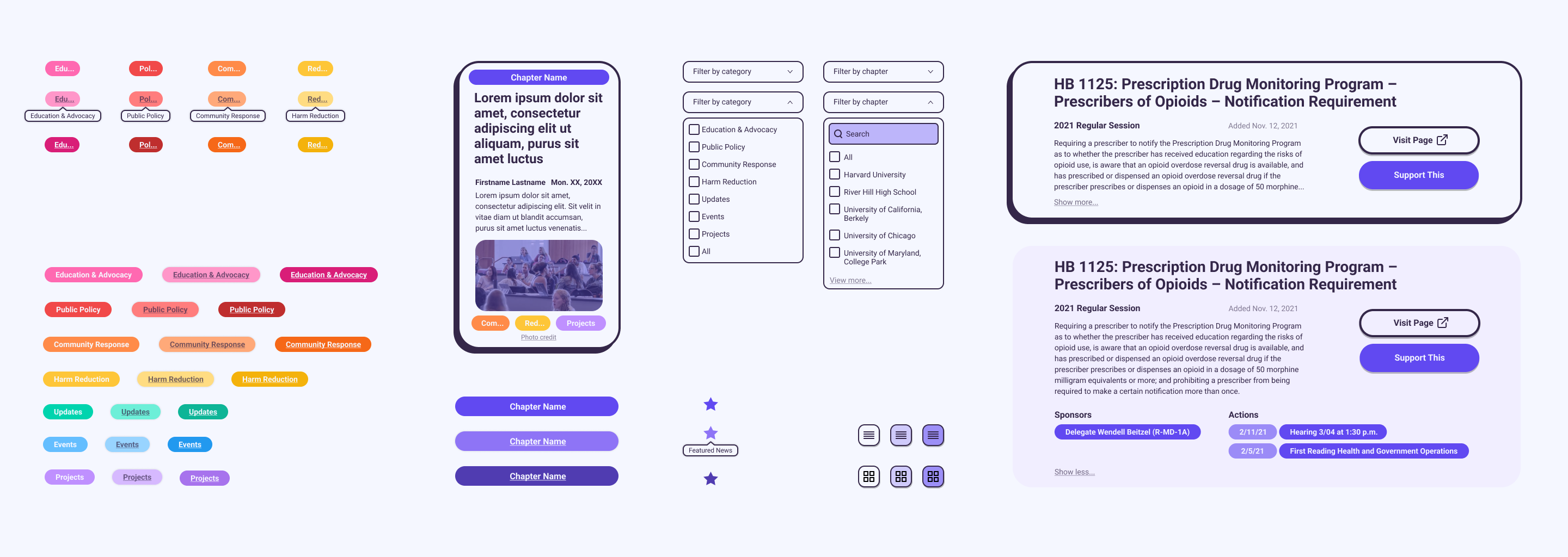
We compiled a list of website features that would support CORA’s goals of fostering collaboration and boosting engagement.
To determine where these features would fit within the parent-child system, we conducted a card-sorting exercise with three advisory board members and three chapter organizers.
National Organization
- National event feed.
- Featured chapter updates and achievements.
- Chapter search.
- “Start a Chapter” form.
Chapter
- Local news feed with event updates and initiatives.
- “Join Chapter” form.
Both
- Contact information.
- Donation form.
Laying the Foundation
Since CORA chapters would be given flexibility to design their own websites, the advisory board established a set of guidelines outlining key features that they must include. Meanwhile, our design team was responsible for creating the parent website.
We began with a sitemap and user flow.
The user flow refined the national site’s integration within the broader digital ecosystem.
Framework to Functionality
Next, we moved on to building early prototypes and testing them with three CORA members and four unaffiliated students. Their feedback revealed these areas for improvement:
Users wanted more focus placed on policy initiatives, since these were a major touchpoint for engagement.
Solution: Feature important updates to initiatives on the news feed.
Users wanted a more robust news section with categorization.
Solution: Add category tags and more granular filters to the news section.
The Start of a Stronger Network
Given the tight timeline, we focused on designing the member-facing side of the system. While this was a strong start, CORA organizers would greatly benefit from an interface that enables chapters to cross-reference events, initiatives, and publications for the purpose of collaborating.
This project provided me with valuable insights into designing parent-child website systems and creating cohesive digital ecosystems. These lessons have since informed how I approach my work in digital marketing, where I’ve crafted seamless user experiences across social media, email campaigns, and webpages.
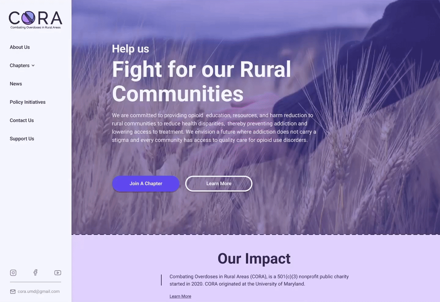
Collaborating with a volunteer team of web developers, we implemented the prototype and laid the groundwork for CORA’s digital presence. As of this project’s completion, CORA is still building their infrastructure and preparing to scale.
Our design has been fully integrated into their broader expansion model, ensuring new chapters and organizers can onboard effortlessly once their infrastructure is in place.
Next
Grassroots Grocery Volunteer Platform
Internship
UX, UI, Research, Brand Identity, Illustration